

In this post, I'm going to point out the sources from where I got inspiration for designing a website with no web design skill.
Good artist copy, great artist steal - Picasso
I have always been a skilled copyist & not creative, but the maxim by Picasso makes it seem okay.
So that's what I did with a website I am building, called Quiller Bee.



 Derpy Coder
It's an open source Job Portal where companies need to be invited to post jobs, and it is supposed to address a few other pain points I had, Like:
 Abhijit Kar
So here are the steps I took:
Steps
1. Name the Website

First hurdle we need to cross is naming, It's not something to be done at last.
If it isn't obvious, then let me tell you why. Name gives brand, meaning, and people associate a certain image to the word after the product becomes well known.
So it is fitting, that the design be inspired by that word from the get go.
But there's no magic bullet to the problem of naming things. I have had several sleepless night because of my inability to come up with one. I have solved countless tough coding questions with just one night of sleep, but naming something proved challenging.
The problem isn't my english, I have been through the dictionary several times in my search for a name, rather It's because of:
- Domain Squatters:
- Any english word you can think of is taken. (Even poop.com!)
- Combination of 2 english word is taken as well.
- Top Level Domain (Dot Com):
- It still reigns supreme and, gives credibility to sites using it.
- So we shouldn't just pick up any random top level domain and call it a day.
- To top it off, Social Networks account are also likely taken for the names we come up with.
So how do we solve this?
My guess is as good as any, but I can point out some of the routes I took:
- Use words taken from different language. (Like: Kotaku, or Vite)
- Use word plays like Anagram, Pig-Latin, Acronym, Backronym, Spoonerism.
- Use fantasy name generator or something similar.
- Use dictionary for synonyms. See: OneLook.
- Combine words. With: NameMesh.
- Opt for
.ioor.appor.devtop level domains, for technical sites, as last resort. - Whatever you do, you must verify that the name is available for use in Twitter, Reddit or whatever social sites you prefer. Checkout: Lean Domain Search.

As for me, I eventually stumbled upon an idea because of serendipity and through epiphany I was able to fuse them together.
It went something like this:
Similar to how bees collect nectar from flowers and convert it to honey, we do the same but with Jobs from finest companies. And then we stitch them together for people to see online, like quilting or quilling. (Thus: Quiller Bee)
2. Decide on Color
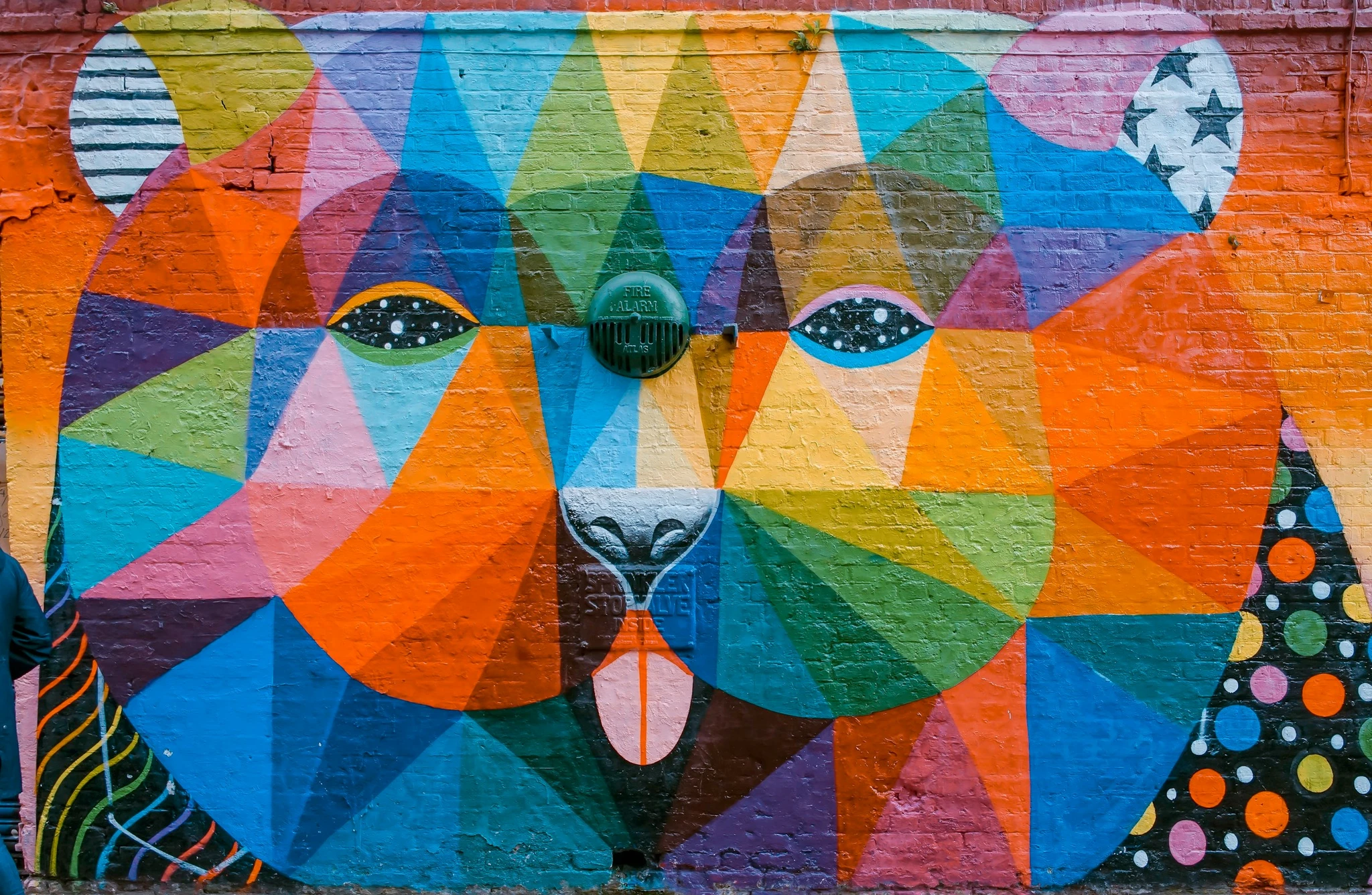
Choosing color is tough, & without an artistic side it is almost impossible, to get right. So how do we tackle this?
We do it by:
a. Deriving from Website Name
Remember how I stressed that deciding upon the name of the site is important, it's because we can form a mental picture of the end product.
So deciding to use Quilting & Bees means that we can choose from a lot of colors and know that they will look great together.
b. Being Pragmatic
Being a programmer, I opted for developing the dark mode first as it rests my eye while developing at night. Also it can mean like we, Quiller Bees, are working at night!
In dark mode, the header looks as if space blends into atmosphere and the footer looks like the water becomes darker towards the bottom. Giving the site a sort of atmospheric feel.
And in light mode, I am going to follow the same logic as dark mode, only with sky blue color.
c. Using Color Theory
Knowing color harmony can help us further by letting us derive colors from the ones we have already chosen, so that they play well together. (We can use a tool like Adobe Color, to help us generate more sensible colors!)
See: Color Theory for Designers, or
 Rikard
d. Using Logical Reasoning
Bees are Yellow and opposite to Yellow is Purple, whose opposite is Green. Hence, Green & Yellow are going to look great on a Purple background. (Which I have used in the typewriter text in the header of Quiller Bee)
Similar logic can be applied further to derive even more color. Like Yellow contrasts well when used on top of a Black background, so that's why the ribbon on the filter to left, uses Yellow color. (Filter box is visible in desktop view as of now.)
e. Restricting the Color Palette
I'm tempted to add as many colors as possible, but I might mess everything up.
So it's wise to take a page from Pixel Artist's book and use as little colors as possible. If you can't believe that we can do it without more colors, google "1 bit pixel art" to see all the incredulous artworks possible with just 2 colors.

3. Make Background Interesting

We only get a few moments to capture attention of visitors and what's better than to have an interactive background users can mess around with.
Apple does it well, however people without a tangible product can only do so much.
So I put on my pirate hat and picked up a cool interactive background from Codepen, that plays well with my love for Space! (I have added links to every resource I picked up, in the source code, and later I am going to create a page with links to each and every one of them.)
4. Use SVG
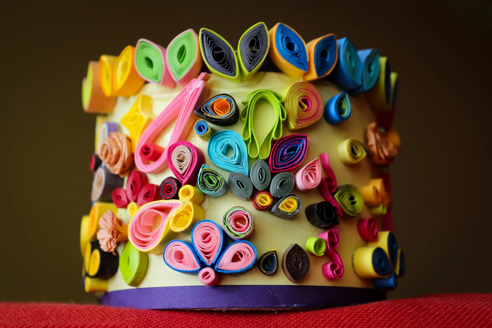
Quilling looks like someone used Scalable Vector Graphics on paper. It makes extensive use of curves, which is like a super power of SVG. (i.e. Bezier Curves)
Also Bees in the name meant that I can make use of the Honeycomb design somewhere.
Luckily, I found the kind of curves I was looking for from Tailwind Toolbox, and hexagon SVG from a Codepen.
Those curves and polygons now adorn my site and they look like Clouds in space at the top and Waves of water at the bottom and Honeycomb in the middle.
5. Choose CSS Framework

You can use behemoths like Bootstrap, Foundation or Material Design for boilerplate or pretentious look.
Or you can opt for a lightweight CSS Micro Framework like Tailwind CSS. It's a topic of its own, but here's the gist of why it's the best: .
You can configure it to your heart's content, or let it be the way it is. Because the defaults look gorgeous and there are a lot of premade templates for Tailwind CSS. Checkout:
Readymade Tailwind Blocks:
- Tailwind UI.
- Meraki UI.
- Tail Blocks.
- Tailwind Toolbox.
- Tailwind UI Kit.
6. Utilize Generators

Anything you can think of making in CSS, try googling it with the keyword 'generator' in suffix. You will be surprised to see just how many generators there are.
Here's a list of generators I liked:
- SVG Wave. See Get Waves, SVG Waves, Outpan.
- Animated Background. See: Vanta JS, Naker.
- SVG Background. See: SVG Background Generator.
- Button. See: CSS Button Creator.
- Shadow. See: CSS Matic.
- Ribbons. See: CSS Ribbon Generator.
- Circular UI. See: Circulus. (It is somewhat broken, needs to be manually fixed before using)
- Neomorphism. See: Neumorphism UI.
- QR Code. See: QR Code Monkey.
- Loader. See: Loading.io.
- Gradient. See: Egg Gradients, CSS Gradient.
I was going to suggest a skeleton generator, but if you are using Tailwind CSS, it's super easy. Just add animate-pulse class to an element. See: Tailwind CSS Pulse.

7. Place Placeholders

Nothing is as daunting as staring at blank canvas. So I would suggest that we fill up the negative space quickly to take out the negativity.
You might be familiar with Lorem Ipsum text already. However I decided against that, and thought I would rather fill up the site with something that makes sense, as I don't want Google to remember the site by gibberish.
But images are different, so I explored and found out several services:
Services
- For Images. See: Unsplash, Pexels.
- For Profile Pics. See: UI Faces, UI Avatars, RoboHash.
- For Blank Rectangles. See: Fake Image.
In case you decide to use blank rectangles as placeholders, I would want you to use a library that generates placeholder directly in the browser using SVG, rather than downloading the whole thing from a network each time you refresh. See: Holder JS.
8. Steal from Competition

The best example of taking inspiration from competition is Plausible, the best privacy focused alternative to Google Analytics. They selectively took pieces from other Privacy Focused Analytics Tools and created the best tool there is. See: 10 Reasons Plausible is the Best Analytics Tool.
Similarly, I took inspiration from several Job Portals, and hope to make the best one there is. See:
- AngelList
- Remote OK
- Remotive
- Nomad List - Yet to make a use of this design though.
9. Peek at Design Sites
I got the inspiration for the hover effects of the honeycomb from a Codepen, and then implemented that effect with pure SVG.
If we remain oblivious of what others are doing, then our output will reflect that. This can be observed in candidates who are freshly out of college, and have been educated with 1950s tech stack, their design looks amateurish simply because they don't know any better. (Like I didn't, when I started out.)
We can easily remedy that, by taking inspiration from:
- Awwwards
- Codepen
- CSS Tricks
10. Shell out Money
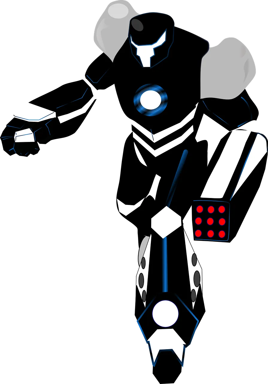

I made the logo for Quiller Bee and my blog Derpy Coder. However it can be better. (I took inspiration from for Quiller Bee's Logo)
It looks passable at the moment, but eventually I want to have a logo that outshines what I already have.
I can think of 3 ways we can go about it:
- Make a generic icon with Canva.
- Pay someone from Fiverr and hopefully get a good logo.
- Reach out to someone, whose work you have seen. Like: / .
Conclusion
It is very easy to get carried away with our imagination.
For instance, I wanted to add koi fish below the job posts. I wanted the header and footer to look like beaches and the jobs posts between would have looked like english channel, with fish swimming underneath job posts. (See Koi Pond Codepen)
And I wished I could use 3d or 2d visuals made with Three.js or Pixi.js and that browsers were fast from the get go. But those effects would bog down the website to a crawl. (Visit ShaderToy and you'll see what I mean.)
Having grounded myself in reality, I used the 10 steps mentioned above and made something beautiful. I know they are obvious, but those weren't obvious when I started, so I hope it helps someone out.
So start with the baby steps of choosing a name, and take it from there...
Quiller Bee is open source in case you want to have a look:
 quillerbee
P.S. I wish chrome would get rid of the ugly scrollbar, so we won't have to think about it in this day and age. (What's stopping them from making the desktop scrollbar look like mobile's?)
Let me know your thoughts down in the comments below.
- Tips
- Tutorials
- Web Development
- Observations
- Experiments
- #JavaScript




Leave a Comment